UX Mistakes That Kill Conversion Rates
Discover the most common ecommerce UX errors that reduce conversions and learn how to fix conversion blocking UX issues that impact revenue.


Most ecommerce teams focus on driving more traffic. They invest in paid media, optimize targeting, and expand reach. However, traffic alone does not guarantee revenue. If the user experience creates friction, even high-intent visitors will leave without converting.
UX mistakes in ecommerce often go unnoticed because they seem minor in isolation. A slow-loading page, a confusing navigation menu, or a complicated checkout flow may not appear critical. In practice, these issues compound and create a poor experience that reduces conversions.
Conversion blocking UX does not just impact immediate sales. It also affects how users perceive the brand. Frustration leads to abandonment, and abandonment reduces the effectiveness of every marketing effort tied to that experience.
Improving UX requires a clear understanding of where friction occurs and how users move through the site. The following sections break down the most common ecommerce UX errors and how they limit performance.
Quick Takeaways
- UX mistakes in ecommerce directly reduce conversion rates and increase drop-off
- Friction in navigation, checkout, and page speed prevents users from completing purchases
- Poor mobile experience remains one of the most common conversion blockers
- Lack of clarity in messaging creates hesitation and reduces trust
- Fixing UX issues often improves performance faster than increasing traffic
Confusing Navigation Disrupts the Buying Journey
Navigation should guide users toward products quickly and clearly. When it fails, users struggle to find what they need and often leave.
Many ecommerce sites attempt to show too many options at once. Overloaded menus, unclear category labels, and inconsistent structure create confusion. Users should not need to think about where to click next.
Clear navigation depends on logical grouping and consistent naming. Categories should reflect how users search, not how internal teams organize products. Filters and sorting options should also be intuitive and easy to access.
Small changes in navigation can have a measurable impact. Simplifying menu structures and improving category clarity reduces friction and helps users move through the site with confidence.
Slow Page Speed Reduces Engagement Immediately
Speed remains one of the most critical factors in ecommerce UX. Users expect pages to load quickly. Delays create frustration and increase bounce rates.
Even a one-second delay can affect conversions. Slow product pages interrupt momentum and reduce the likelihood of purchase. This becomes more pronounced on mobile devices, where performance issues are more common.
Common causes of slow page speed include:
- Large, unoptimized images
- Excessive scripts and third-party integrations
- Poor hosting or server response times
Addressing these issues improves both user experience and search visibility. Faster pages keep users engaged and allow them to move through the buying process without interruption.
Poor Mobile Experience Blocks Conversions
Mobile traffic continues to dominate ecommerce. However, many sites still treat mobile optimization as secondary.
A poor mobile experience creates immediate friction. Buttons may be difficult to tap, text may be hard to read, and layouts may not adapt properly to smaller screens.
Common mobile UX issues include:
- Crowded layouts that require excessive scrolling
- Forms that are difficult to complete on a phone
- Checkout flows that are not optimized for mobile interaction
Mobile users often have less patience and higher expectations for simplicity. If the experience feels difficult, they leave.
Optimizing for mobile requires more than responsive design. It requires intentional design decisions that prioritize ease of use and speed.
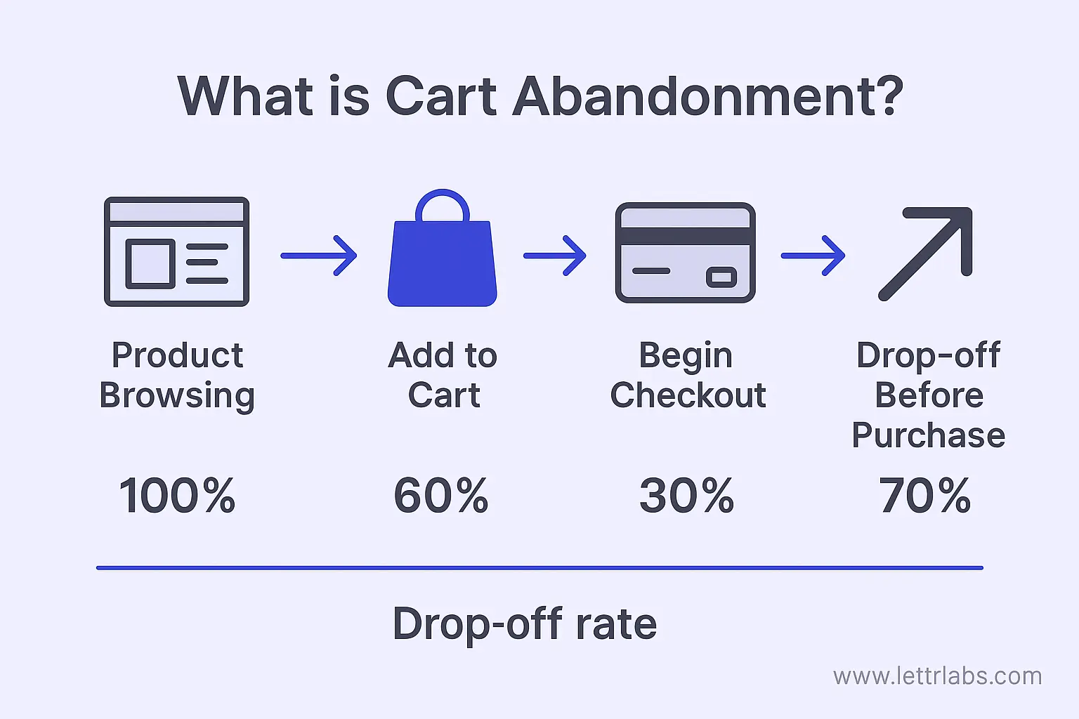
Complex Checkout Processes Increase Abandonment
Checkout should be simple and efficient. When it becomes complicated, users abandon their carts.
Many ecommerce sites introduce unnecessary friction during checkout.
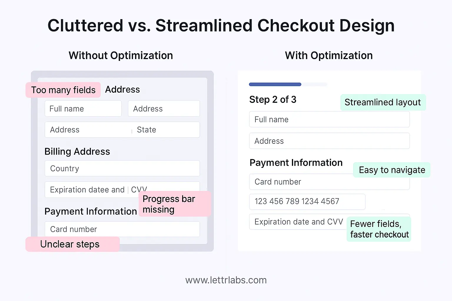
This includes requiring account creation, adding too many form fields, or hiding key information such as shipping costs until the final step.
Users expect transparency and speed. Any unexpected step creates hesitation.
To reduce abandonment, checkout flows should:
- Minimize the number of steps required to complete a purchase
- Offer guest checkout options
- Clearly display pricing, shipping, and delivery information early
Simplifying checkout improves completion rates and creates a smoother experience.
Lack of Trust Signals Reduces Purchase Confidence
Trust plays a central role in ecommerce conversions. Without it, users hesitate to complete transactions.
Many sites fail to clearly communicate credibility. Missing reviews, unclear return policies, and lack of security indicators create doubt.
Users want reassurance before they purchase. They look for signals that confirm the brand is reliable and the product meets expectations.
Effective trust signals include:
- Customer reviews and ratings
- Clear return and refund policies
- Secure payment indicators
- Transparent product information
These elements reduce uncertainty and help users feel confident in their decisions.
Weak Product Pages Fail to Support Decision-Making
Product pages serve as the final step before conversion. If they lack clarity or detail, users leave.
Many ecommerce UX errors stem from incomplete or poorly structured product pages. Missing images, vague descriptions, and lack of key information create friction.
Strong product pages provide:
- High-quality images from multiple angles
- Clear, concise descriptions
- Relevant specifications and details
- Supporting content such as reviews or FAQs
Users should not need to search for information elsewhere. Everything required to make a decision should be available on the page.
Improving product pages often leads to immediate gains in conversion rates because it addresses hesitation directly.
Inconsistent Messaging Creates Friction
Consistency across the user journey is essential. When messaging changes between ads, landing pages, and product pages, users lose confidence.
For example, a paid ad may highlight a specific offer, but the landing page may not reflect the same message. This disconnect creates confusion and reduces trust.
Consistency requires alignment across all touchpoints. Messaging, visuals, and value propositions should remain clear and unified.
This is particularly important for paid media campaigns. Traffic generated through ads must land on pages that match user expectations. Any mismatch increases drop-off.
Ignoring Data Leads to Missed Opportunities
Many ecommerce teams rely on assumptions instead of data when evaluating UX. This limits their ability to identify and fix issues.
User behavior data provides insight into where friction occurs. Metrics such as bounce rate, time on page, and conversion paths highlight areas that need improvement.
Heatmaps, session recordings, and funnel analysis tools also reveal how users interact with the site. These insights allow teams to make informed decisions rather than relying on guesswork.
UX optimization should be an ongoing process. Continuous testing and analysis help teams refine the experience and improve performance over time.
Improve Conversion Performance Today with Monkedia
UX mistakes in ecommerce reduce the effectiveness of every marketing effort. Traffic alone cannot drive growth if the experience creates friction.
Addressing conversion blocking UX issues improves performance quickly. Clear navigation, faster load times, simplified checkout, and consistent messaging all contribute to stronger results.
Teams that prioritize UX create a more efficient path from discovery to purchase. This leads to higher conversion rates and better return on investment.
Monkedia helps brands scale paid media through a balance of data, creative, and predictive insight. By focusing on sustainable growth and measurable outcomes, Monkedia supports teams looking to expand performance without sacrificing ROAS.

